The Greenbank Hotel

Bringing wonder to an historic hotel

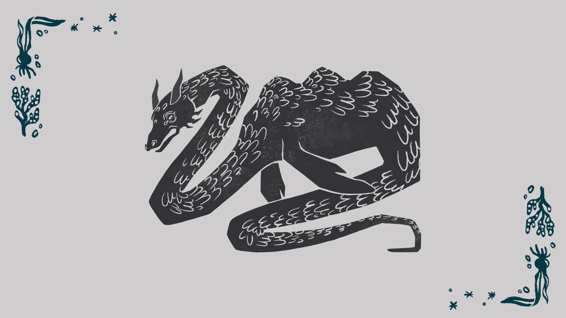
The Greenbank Hotel is over 400 years old, and in its time it’s heard its fair share of epic adventures and tall tales, from seafarers bring their stories in from their travels, to Kenneth Greene creating Wind in the Willows while staying there. As part of a new site build, we refreshed the brand identity, and created a new tone and style that puts story and wonder at the forefront. Illustration, animation, character, power and features – this one is full to the brim.

BRAND | IDENTITY | WEB | ILLUSTRATION | SOCIALS ASSETS | ANIMATION

Become Charity Rebrand

A brand and website, repositioning Become as a champion of care-experienced young people, fighting for those let down by a broken system.

We’ve been working with Become for many years, from co-creation sessions with young people to digital campaigns; we’ve done it all. Most recently, we’re proud to have created an entirely new brand identity, updated content managed website and design services as part of a huge overhaul for the national charity.

BRAND | RESEARCH | IDENTITY | WEB | ILLUSTRATION | CAMPAIGN | SOCIALS | ANIMATION

Allen & Heath

A comprehensive new digital home for one of the world’s most respected audio hardware brands.

A ground-up rebuild of Allen & Heath’s WordPress website. There are almost too many details and features to mention here; a high-traffic e-commerce solution, members portals with software-licence management, a support section with version-managed documentation, distributor networks, the list goes on. All this is is wrapped in a refreshed design direction bringing a new lease of life to the digital presence of a brand that was already thriving.

WEB | DESIGN | BUILD

Tewkesbury Park

Independent spirit, incredible setting

Tewkesbury Park is an award-winning hotel set amongst the rolling hills of Gloucestershire. We worked closely with them to refresh their brand, values, communications and strategy, as well as a beautiful, immersive content-managed website

BRAND | |POSITION | IDENTITY | WEB | ILLUSTRATION | SOCIALS ASSETS | ANIMATION

Foyer Federation Advantaged Thinking

For too long society has been defining people by deficit or circumstance, tagging people with unhelpful labels like “unemployable”, “homeless” or “unable to work”. Advantaged Thinking offers a new way to look at each other.

Starting with what’s best about humanity, championing people’s strengths and seeing the capability in everyone, then using this positive outlook to achieve genuine, deep-seated, evidence-driven change for organisations and people.

BRAND | IDENTITY | WEB | ILLUSTRATION | ANIMATION

The Alverton Hotel

The Alverton Hotel is a four silver star hotel tucked away in a quiet corner of Truro, Cornwall. We were tasked with creating a new website  – as well as the upkeep and adaptation of The Alverton’s existing brand through creative direction, design and illustration.

https://thealverton.co.uk

Tin Coast

Branding Cornwall’s beating heart.

Bluefruit

A new brand identity built around an existing logo for one of the countries leading embedded software specialists.

Next Steps South West

Next Steps South West are an organisation operating throughout the Southwest who are dedicated to guiding young people through their journey to higher education. They came to us looking for a refresh of their brand identity, complete with a new logo, new additions to their website, and printed and digital assets.

nextstepssw.ac.uk

Pollada

Cool Earth approached us with an exciting new campaign that needed an eye-catching, invigorating identity. The campaign is an ambitious take on the ‘pollada‘, a Peruvian tradition where a family creates a delicious meal in exchange for donations that go towards an important cause.

coolearth.org/pollada

London Surf Film Festival 2019

London Surf/Film Festival 2019 was another stormer. Ahead of the 10 festival the team wanted the branding to be an evolution of the previous years – the most successful year yet. We created a remix of last year’s video, as well as adding to the usual bevvy of print, t-shirts, freebies, trophies and the like.

OCO

OCO is a minimalist music puzzle platformer you can play with one hand.  Spectrum48, approached us to collaborate with them in developing the UI/UX – an opportunity we jumped on without hesitation.

London Surf / Film Festival 2018

Eight years in, and the London Surf / Film Festival is still pushing us to innovate. Loosely based around the theme of “elements of surf” the festival extended its sell-out run to five nights. New trophies, world premiers, legendary surfers and a willingness to innovate, cements the event as one of the world’s leading surf festivals.

Mosevic

Mosevic designs products, with a passion for creating stylish, functional, lifestyle goods.

Design

When we met Jack and Alex they had an unfinished product and an open mind. We took advantage of that and took them through an exhaustive process – examining everything from the brand’s promise and personality through to detailed investigations of colour usage, on-product placement and even model choices and launch campaigns.

Since launching they’ve smashed their kickstarter goals, achieved some fantastic press and are currently ramping up production for general release.

* Additional design by Mosevic and photography by Artur Tixiliski


Mosevic promise

Logo and icon

Brand workshops and identity development

Mosevic

Morphing logo

Product photography

The brand in print*

Brand photography using archetype guidelines*

Contact

Venn Creative, 59-61 Killigrew Street, Falmouth, Cornwall, TR11 3PF

01326 377 105 | [email protected]